


Techfino Branding Guidelines

Introduction
The Techfino Corporate Identity is a visual representation of our brand positioning. The following pages will help you understand our strategic and visual foundation to inspire and create new communications and experience for the Techfino Brand.
Short Version
Techfino LLC is a passionate group of techno-functional NetSuite experts with an innate desire to help companies of all sizes scale and grow. Headquartered in Philadelphia, this national consultancy specializes in designing, implementing, and managing best-in-class cloud solutions.
Long Version
Techfino LLC is a passionate group of techno-functional NetSuite experts with an innate desire to help companies of all sizes scale and grow. Headquartered in Philadelphia, this national consultancy specializes in designing, implementing, and managing best-in-class cloud solutions.
From NetSuite licensing, to training, to support, to integrations and optimizations, Techfino is hyper focused on solving the demanding challenges of ever-changing business models, bringing specialized expertise in retail, wholesale, manufacturing, professional services, non-profit, commerce and beyond. Techfino is also proud to have developed several proprietary data management products for NetSuite including Cleansweep File Manager and Archive tools.
For more information about Techfino, their products and service offerings, visit www.techfino.com
Bryan Willman
Bryan Willman is the co-founder, and CEO at Techfino, an elite Oracle | NetSuite Partner and full-service cloud software consultancy. Bryan started as a technology consultant specializing in developing business applications, and more recently became an expert implementing NetSuite ERP Software for some of the largest companies in the world. Since starting Techfino, Bryan and his team have been hyper focused on solving challenging problems and unlocking RIO for fast-growing businesses running NetSuite.
Techfino logos
All logos are high-quality .png with a transparent background.
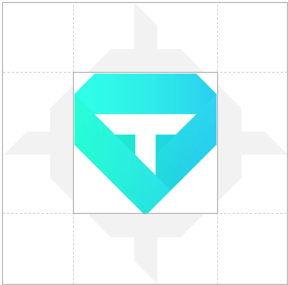
The mark.

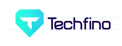
Full logo type lockup.
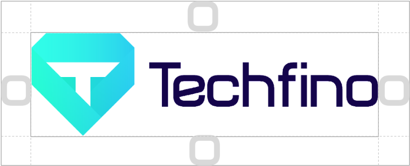
Keep the area around the logo relatively clear.
Minimum clear space is equivalent to the letter "T" on the logo icon and the letter “o” on the logotype.
No other logos, type, or other graphic elements should infringe on its space except for its corresponding logo type.
Color Palette
Navy Deep
HEX #000042
CMYK 100, 94, 42, 54
Navy
HEX #23237B
CMYK 100, 96, 21, 4
Teal
HEX #53E0DC
CMYK 52, 0, 30, 0
Orange
HEX #F55B3D
CMYK 0, 82, 80, 0
Purple
HEX #4040B2
CMYK 87, 77, 0, 0
Off-White
HEX #F5F6FA
CMYK 7, 6, 2, 0
Gray Border
HEX #D0D0E0
CMYK 17, 14, 4, 0
Gray Text
HEX #53535F
CMYK 66, 57, 42, 35
Logo Color Palette
Gradient Colors
Pantone: 5255
HEX: #1C004C
RGB: 28, 0, 76
CMYK: 90, 100, 0, 60
Pantone: 361U
HEX: #50FFB9
RGB: 80, 255, 185
Pantone: 2995
HEX: #4FCEFA
RGB: 79, 206, 250
CMYK: 100, 0, 0, 0
Text Color
Techfino Midnight Blue
HEX: #000042
RGB: 0, 0, 66
CMYK: 100, 100, 0, 74
Background Color
Techfino Violet
HEX: #23237B
RGB: 35, 35, 123
CMYK: 71, 71, 0, 51
Non-Gradient Print Logo
Techfino Turquoise
HEX: #53E0DC
RGB: 83, 224, 220
CMYK: 62, 0, 1, 12


The Official Typeface: Barlow
ABCDEDFGHIJKLMNOPQRSTUVWXYZ
Abcdefghijklmnopqrstuvwxyz
123456789 !@#$%^&*()_
ABCDEDFGHIJKLMNOPQRSTUVWXYZ
Abcdefghijklmnopqrstuvwxyz
123456789 !@#$%^&*()_
ABCDEDFGHIJKLMNOPQRSTUVWXYZ
Abcdefghijklmnopqrstuvwxyz
123456789 !@#$%^&*()_
ABCDEDFGHIJKLMNOPQRSTUVWXYZ
Abcdefghijklmnopqrstuvwxyz
123456789 !@#$%^&*()_
ABCDEDFGHIJKLMNOPQRSTUVWXYZ
Abcdefghijklmnopqrstuvwxyz
123456789 !@#$%^&*()_
This wordmark is the current official standard. Askfino's full visual identity (icon, avatar, product UI) is still in workshop and not yet finalized.
Teal
“Ask” · accent
HEX #53E0DC
Navy Deep
“fino” · primary text
HEX #000042
Purple
Bridge · gradient origin
HEX #4040B2
Off-White
Surface · light
HEX #F5F6FA
Brand gradient
Purple #4040B2 to Teal #53E0DC
The Official Typeface: Barlow
ABCDEDFGHIJKLMNOPQRSTUVWXYZ
Abcdefghijklmnopqrstuvwxyz
123456789 !@#$%^&*()_
ABCDEDFGHIJKLMNOPQRSTUVWXYZ
Abcdefghijklmnopqrstuvwxyz
123456789 !@#$%^&*()_
ABCDEDFGHIJKLMNOPQRSTUVWXYZ
Abcdefghijklmnopqrstuvwxyz
123456789 !@#$%^&*()_
ABCDEDFGHIJKLMNOPQRSTUVWXYZ
Abcdefghijklmnopqrstuvwxyz
123456789 !@#$%^&*()_
Two arrangements, one hierarchy
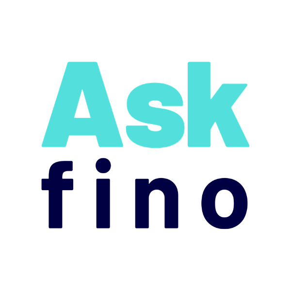
Askfino is a pure wordmark, no icon. The horizontal wordmark is the standard, used wherever space allows. The square wordmark is the companion, reserved for square or width constrained surfaces.
“Askfino” on a single line. The default signature for headers, browser bars, badges and any context wide enough to read it in one line.
“Ask” over “fino”, full width, a balanced near square block for app icons, social avatars, tiles and other square or narrow formats.
Clear space and minimum size
Protect the wordmark's legibility. Never take it below the minimum size for its medium.
Leave a margin equal to the cap height of “Ask”, one x, on all four sides. Keep this zone free of text, other logos and graphic elements.
Below these sizes the lettering loses definition. Use the horizontal wordmark wherever it fits, switch to the square wordmark only in tight square formats.
Horizontal, min 96px wide |
Square, min 40px wide |
The wordmark on any surface
On light surfaces use the two color wordmark. On dark, keep “Ask” teal and flip “fino” to white. On the brand gradient or photography, switch to the single color white wordmark.

Two color, teal + navy

Two color, teal + white

Single color white

Single color, dark scrim
Digital touchpoints
Askfino is a digital product, so every application is a screen. The horizontal wordmark leads wide surfaces, the square wordmark carries the square ones.
Horizontal wordmark
Horizontal, navigation bar
Horizontal, reverse
Square, rounded tile
Square, circular crop
Square, floating button
Feed post format
Powered by, partner surfaces
Horizontal, reverse
“Powered by” badges, sizes
When Askfino sits inside a partner surface, the badge carries the attribution. Three sizes cover most placements.
“Powered by” badges, variants
The two color wordmark is the default; the single color version is the fallback for small sizes or low contrast surfaces.
|
Two-color, on light |
Two-color, on dark |

|
Single-color, on light |
Single-color, on dark |

Do's and don'ts
The wordmark is fixed artwork. Keep its proportions, weights, colors and spacing. Never redraw or restyle it.
|
✓ Use the master wordmarkCorrect weights and color on a clean background. |
✓ Reverse on dark“Ask” teal, “fino” white on dark surfaces. |
|
✕ Don't stretch or squishNever distort the horizontal or vertical scale. |
✕ Don't recolorOnly the approved palette and the white reverse are allowed. |

|
✕ Don't change weights“Ask” stays Black 900, “fino” stays Bold 700. |

✕ Don't rotateThe wordmark always sits on the horizontal baseline. |

|
✕ Don't add effectsNo shadows, glows, bevels or outlines. |

✕ Don't place on clutterOn busy backgrounds use the white wordmark on a scrim. |

Download the logo kits
Official, ready to use assets for both brands. Always pull from these files rather than recreating the mark.

Full lockup, mark only, NetSuite co-brand. SVG, AI, EPS, PNG, CMYK.

8 wordmarks, 4 “powered by” badges, 6 animated reveals. SVG, PNG, JPG.